
Creating Responsive Components with Tailwind CSS: A Step-by-Step Guide
Learn how to create responsive components using the popular utility-first CSS framework, Tailwind CSS. This step-by-step guide will walk you through the process of designing and building flexible, mobile-friendly components for your website or application
Blog post By Prithviraj - Published at 12/27/2022, 11:16:15 AM
Setting Tailwind for nextjs
So for this tutorial, we will use nextjs as our front end. Setting up with react is very similar, but as nextjs is becoming a popular framework so it's good to learn it.
Template for Tailwindcss and Nextjs
yarn create next-app --example with-tailwindcss with-tailwindcss-app
this will generate the boilerplate code for us.
now in file `index.tsx` clear all default things like this:
import type { NextPage } from 'next'
import Head from 'next/head'


const Index: NextPage = () => {
  return (
    <div className="flex min-h-screen flex-col items-center justify-center py-2">
      <Head>
        <title>Create Next App</title>
        <link rel="icon" href="/favicon.ico" />
      </Head>

      <main className="">
      {/* Our Code goes here */}
      </main>

    </div>
  )
}

export default Index
here the Header component goes in `components` directory ;
import Link from "next/link";

export default function Header() {
  return (
    <div className="flex min-h-screen flex-col items-center justify-center py-2">
      <main className="">
        <div className="sm:sticky sm:top-0 sm:z-50 font-sans flex m-1 p-3 justify-center sm:justify-center lg:justify-end shadow-2xl flex-wrap">
          <div className=" hidden sm:flex justify-start flex-grow mx-5 items-center">
            <a href="/">
              <svg
                xmlns="http://www.w3.org/2000/svg"
                className="h-8 w-8 text-blue-400 "
                xmlnsXlink="http://www.w3.org/1999/xlink"
                viewBox="344.564 330.278 111.737 91.218"
                width="53.87"
                height="43.61"
              >
                <defs>
                  <linearGradient
                    id="logo_svg__b"
                    gradientUnits="userSpaceOnUse"
                    x1="420.97"
                    y1="331.28"
                    x2="420.97"
                    y2="418.5"
                  >
                    <stop offset="0%"></stop>
                    <stop offset="100%"></stop>
                  </linearGradient>
                  <linearGradient
                    id="logo_svg__d"
                    gradientUnits="userSpaceOnUse"
                    x1="377.89"
                    y1="331.28"
                    x2="377.89"
                    y2="418.5"
                  >
                    <stop offset="0%"></stop>
                    <stop offset="100%"></stop>
                  </linearGradient>
                  <path
                    d="M453.3 331.28v28.57l-64.66 58.65v-30.08l64.66-57.14Z"
                    id="logo_svg__a"
                  ></path>
                  <path
                    d="M410.23 331.28v28.57l-64.67 58.65v-30.08l64.67-57.14Z"
                    id="logo_svg__c"
                  ></path>
                </defs>
                <use xlinkHref="#logo_svg__a" fill="url(#logo_svg__b)"></use>
                <use xlinkHref="#logo_svg__c" fill="url(#logo_svg__d)"></use>
              </svg>
            </a>
          </div>
          <ul className="flex space-x-7 flex-row ">
            <Link
              href="/posts/**"
              className="hover:text-blue-300 transition-transform hover:translate-y-1 hover:translate-x-1"
            >
              <>Blog</>
            </Link>
            <Link
              href="personal website"
              target="_blank"
              className="hover:text-blue-300 transition-transform hover:translate-y-1 hover:translate-x-1"
            >
              <>Personal</>
            </Link>
            <Link
              href="/about"
              className="hover:text-blue-300 transition-transform hover:translate-y-1 hover:translate-x-1"
            >
              <>About Us</>
            </Link>
            <Link
              href="my github"
              target="_blank"
              className="hover:text-blue-300 transition-transform hover:translate-y-1 hover:translate-x-1"
            >
              <>Github</>
            </Link>
          </ul>
        </div>

        {/* Our Code goes here */}
      </main>
    </div>
  );
}
the changed file:
import type { NextPage } from 'next'
import Head from 'next/head'
import Header from "../components/header";

const Index: NextPage = () => {
  return (
    <div className="flex min-h-screen flex-col items-center justify-center py-2">
      <Head>
        <title>Create Next App</title>
        <link rel="icon" href="/favicon.ico" />
      </Head>

      <main className="">
      <Header/>
      </main>

    </div>
  )
}

export default Index
and then another one for displaying blog articles:
import Link from "next/link";
import Image from "next/image";
export default function DestinationCard(destination: any) {


  return (
    <article className="flex flex-col dark:bg-gray-900">
      <Link
        href={`/posts/${destination.slug}`}
        className="text-[#0070f3] hover:text-[#729ff9] font-semibold text-base"
      >
        <div className=" flex justify-center items-center">
          <Image
            className="aspect-sqar"
            width={400}
            height={300}
            sizes="100vw"
            alt={String(destination.title)}
            src={destination.mainImage}
          />
        </div>

        <div className="flex flex-col flex-1 p-6">
          <p className="text-gray-600">
            {destination.description}{" "}
          </p>

          <h3 className="flex-1 py-2 text-lg font-semibold leading-snug">
            {destination.title}
          </h3>
          <div className="flex flex-wrap justify-between pt-3 space-x-2 text-xs dark:text-gray-400">
            <p className="text-gray-600">
              {" "}
              {new Date(destination._createdAt).toDateString()}{" "}
            </p>
            <p className="text-gray-600">popular</p>
          </div>
        </div>
      </Link>
    </article>
  );
}
We will use `next/image` or the Image component for Image Optimization and SEO.
and now the index:
import Link from "next/link";
import DestinationCard from "../components/post";

const data = {
  _createdAt: new Date(),
  publishedAt: new Date(),
  _id: "184yfnqywqfhqryhfhoa",
  slug: {
    current: "my-fist-blog",
  },
  mainImage:
    "https://cdn.sanity.io/images/kgu0y8sn/production/32b4e87a7dc764a8901f1513e1553c7e3a7e33f2-318x159.png",
  description: "F--- daMN it ",
  author: {
    name: "Xyz",
    image:
      "https://cdn.sanity.io/images/kgu0y8sn/production/32b4e87a7dc764a8901f1513e1553c7e3a7e33f2-318x159.png",
  },
  title: "This example for this tutorial",
};
export default async function Page() {
  return (
    <div className="flex min-h-screen flex-col items-center justify-center py-2">
      <main className="">
        <div className="sm:sticky sm:top-0 sm:z-50 font-sans flex m-1 p-3 justify-center sm:justify-center lg:justify-end shadow-2xl flex-wrap">
          <div className=" hidden sm:flex justify-start flex-grow mx-5 items-center">
            <a href="/">
              <svg
                xmlns="http://www.w3.org/2000/svg"
                className="h-8 w-8 text-blue-400 "
                xmlnsXlink="http://www.w3.org/1999/xlink"
                viewBox="344.564 330.278 111.737 91.218"
                width="53.87"
                height="43.61"
              >
                <defs>
                  <linearGradient
                    id="logo_svg__b"
                    gradientUnits="userSpaceOnUse"
                    x1="420.97"
                    y1="331.28"
                    x2="420.97"
                    y2="418.5"
                  >
                    <stop offset="0%"></stop>
                    <stop offset="100%"></stop>
                  </linearGradient>
                  <linearGradient
                    id="logo_svg__d"
                    gradientUnits="userSpaceOnUse"
                    x1="377.89"
                    y1="331.28"
                    x2="377.89"
                    y2="418.5"
                  >
                    <stop offset="0%"></stop>
                    <stop offset="100%"></stop>
                  </linearGradient>
                  <path
                    d="M453.3 331.28v28.57l-64.66 58.65v-30.08l64.66-57.14Z"
                    id="logo_svg__a"
                  ></path>
                  <path
                    d="M410.23 331.28v28.57l-64.67 58.65v-30.08l64.67-57.14Z"
                    id="logo_svg__c"
                  ></path>
                </defs>
                <use xlinkHref="#logo_svg__a" fill="url(#logo_svg__b)"></use>
                <use xlinkHref="#logo_svg__c" fill="url(#logo_svg__d)"></use>
              </svg>
            </a>
          </div>
          <ul className="flex space-x-7 flex-row ">
            <Link
              href="/posts/**"
              className="hover:text-blue-300 transition-transform hover:translate-y-1 hover:translate-x-1"
            >
              <>Blog</>
            </Link>
            <Link
              href="personal website"
              target="_blank"
              className="hover:text-blue-300 transition-transform hover:translate-y-1 hover:translate-x-1"
            >
              <>Personal</>
            </Link>
            <Link
              href="/about"
              className="hover:text-blue-300 transition-transform hover:translate-y-1 hover:translate-x-1"
            >
              <>About Us</>
            </Link>
            <Link
              href="my github"
              target="_blank"
              className="hover:text-blue-300 transition-transform hover:translate-y-1 hover:translate-x-1"
            >
              <>Github</>
            </Link>
          </ul>
        </div>
        <DestinationCard {...data} />
        <DestinationCard {...data} />
        <DestinationCard {...data} />
        {/* Our Code goes here */}
      </main>
    </div>
  );
}

/* eslint-disable @next/next/no-img-element */
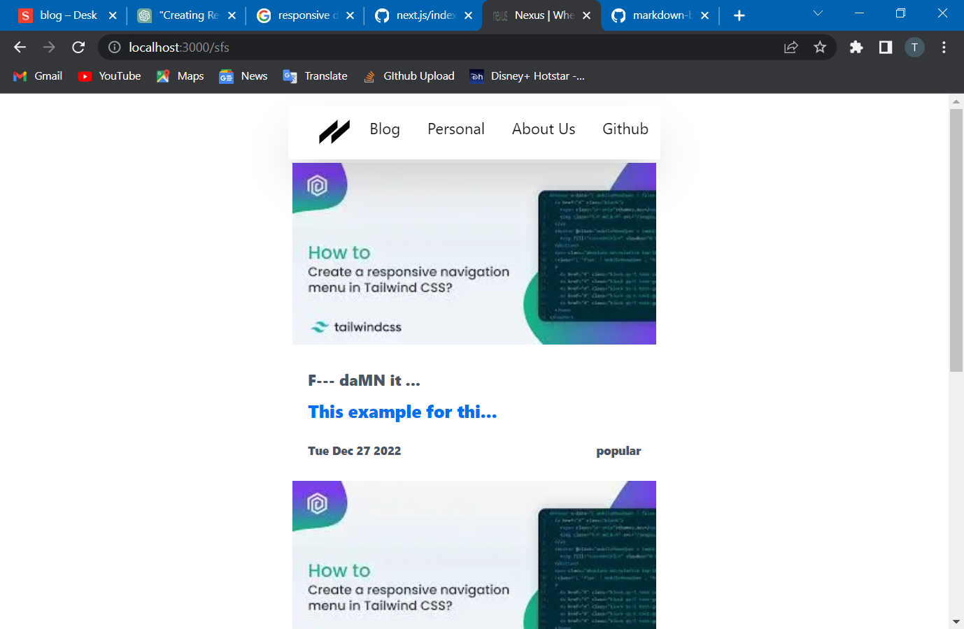
So yeah we are done with the responsive components. Let's see a demo of it
Hope you guys enjoyed the session.